
Internal management system
New application to efficiently manage different roles, multiple layers of forecasting and calculations
Forecast Calculations


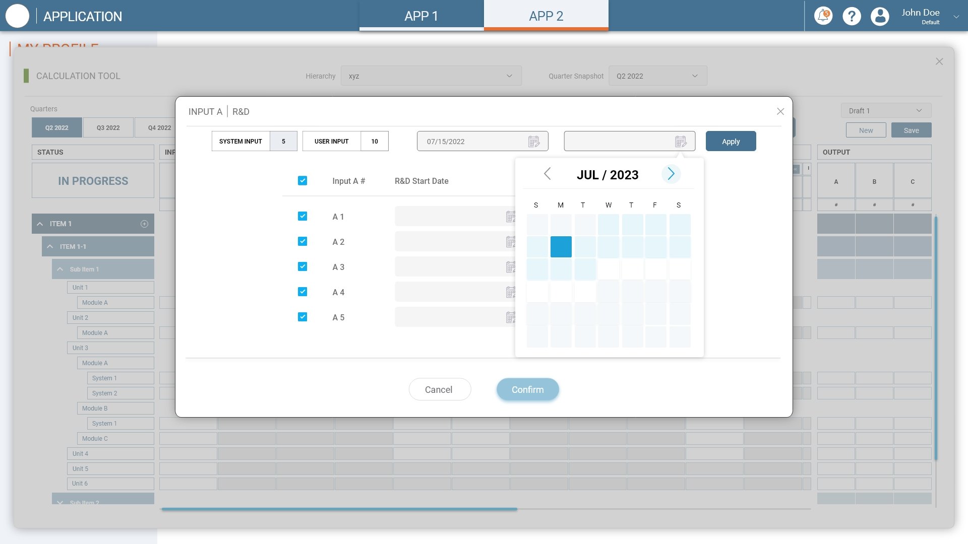


forecast management


Role request management

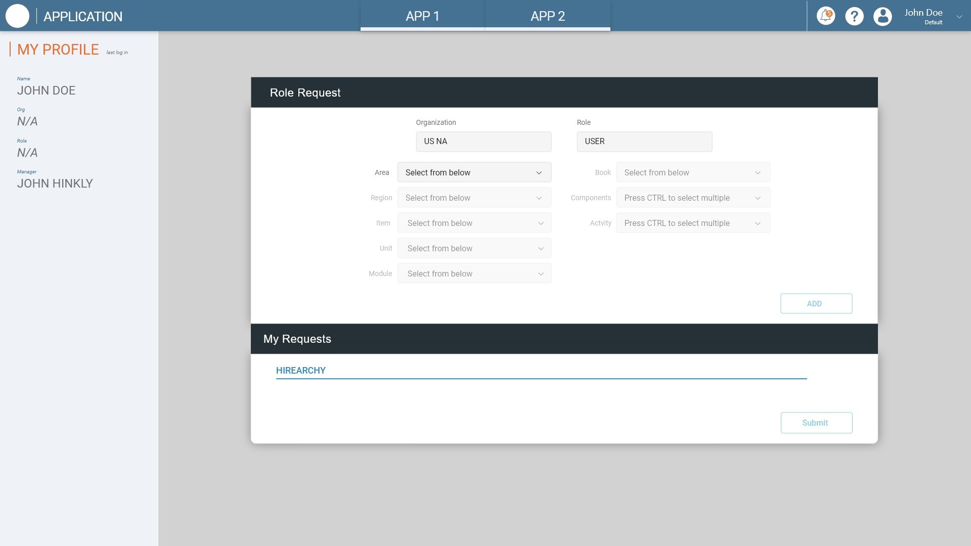


Role management


Admin configurations
Improving the efficiency and the User Experience for configurations by consolidating the needed tools into one system
performance index configurations


role configuration


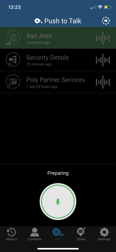
Mobile app feature integration + redesign
Integrating a walking talkie feature into the mobile application while revamping a old design


outdated design
In attempt to consolidate multiple mobile applications, we decided to add the walkie talkie feature from another application to the main mobile app. However because the mobile app has a phone/conferencing feature, a new UI had to be designed to fit in the walkie talkie… not to mention updating the outdated design.
Final design


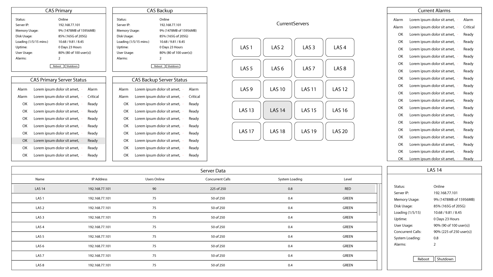
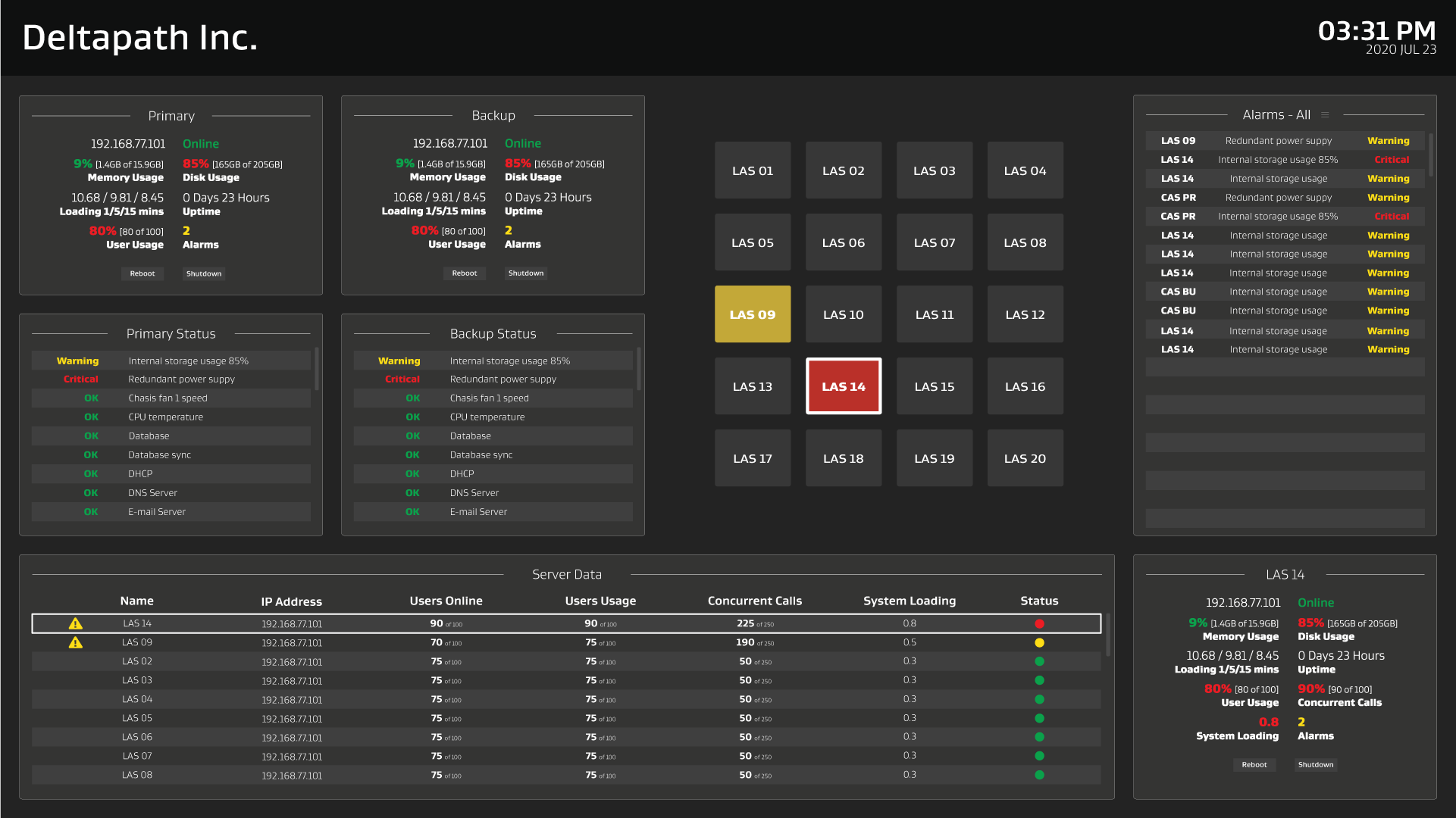
Server status dashboard
New application for to track and display Deltapath UC Service Provider Edition Server’s performance and status
Wire Frames


Low-fi Wire Frame for SPE Dash
Final design


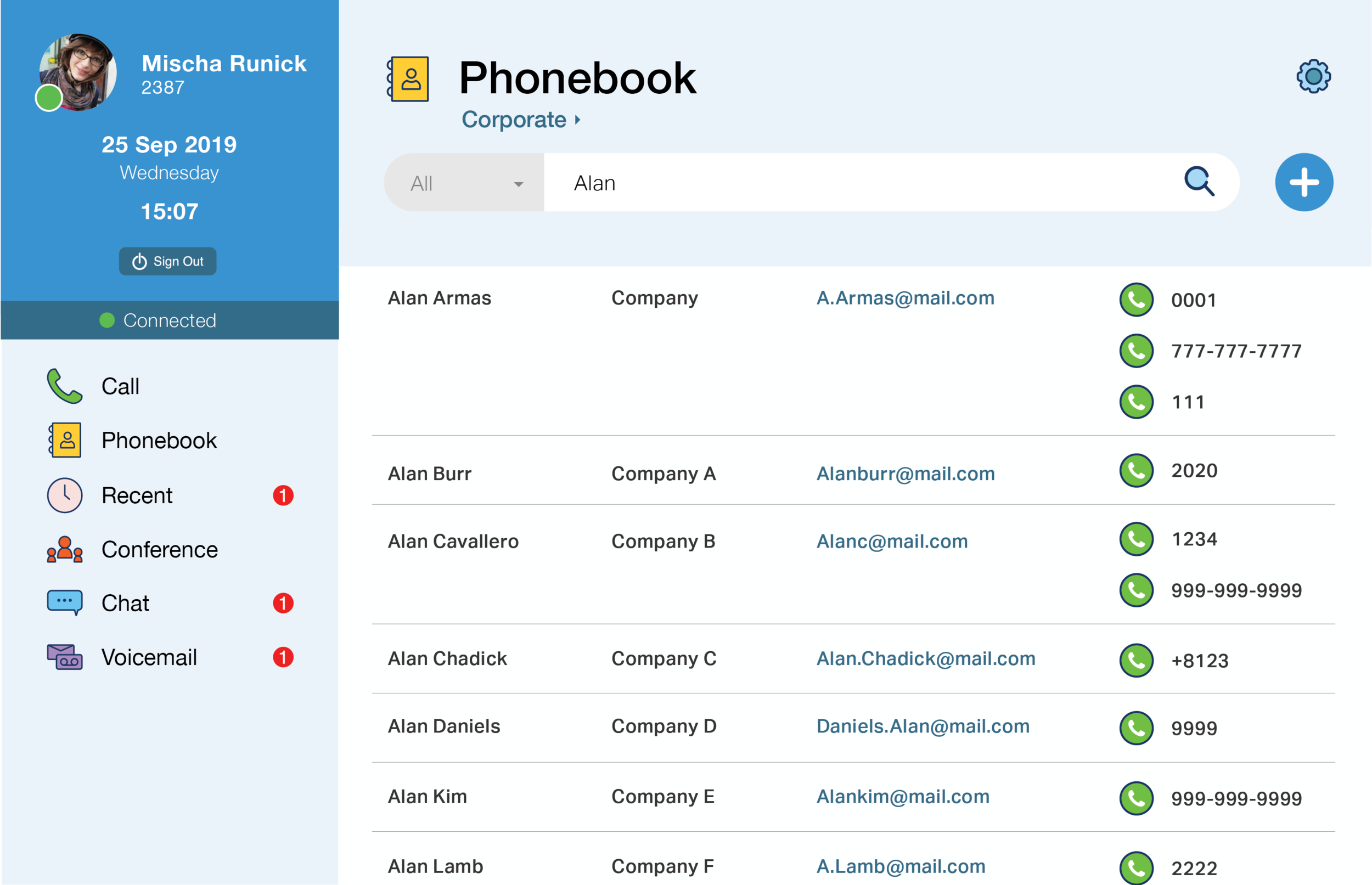
Engage product design
Deltapath currently has an application available for both PC and Mac users allowing video calls and conferences. This application however is not suited for most users as it is overfilled with features that is hard to navigate and not widely used. We wanted to create a new application that was more user-friendly for the masses and focused more towards everyday use features like video/audio calls, video/audio conferencing, chat, calendar, phonebook.


Wire Frames


Low-fi Wire Frame for Engage


High-fi Wire Frame for Engage Version 1
High-fi Wire Frame for Engage Version 2


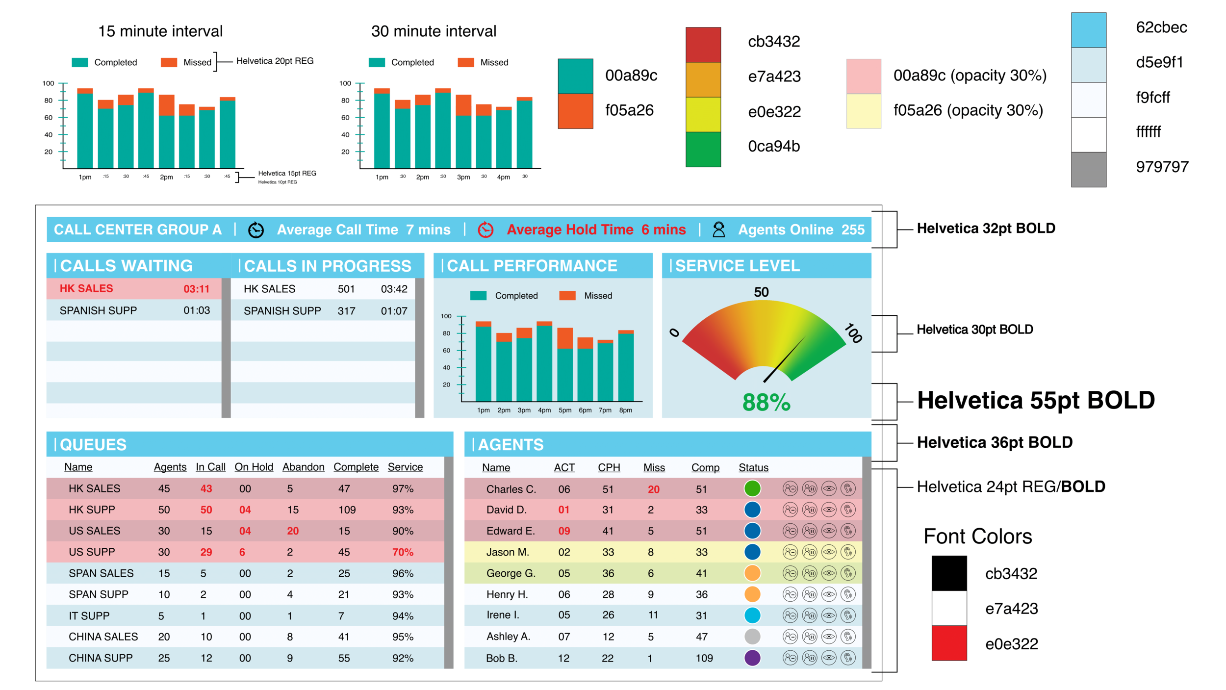
Deltapath Contact Center Redesign
Current clients and future prospective clients have notified the team that the current version of the Deltapath Contact Center was not up to par for the industry standards. The Contact Center was not innovative, not easy to use and lacked a user friendly interface.

Style Guide


Wire Frames


Low-fi Wire Frame for Deltapath Contact Center
Final Design


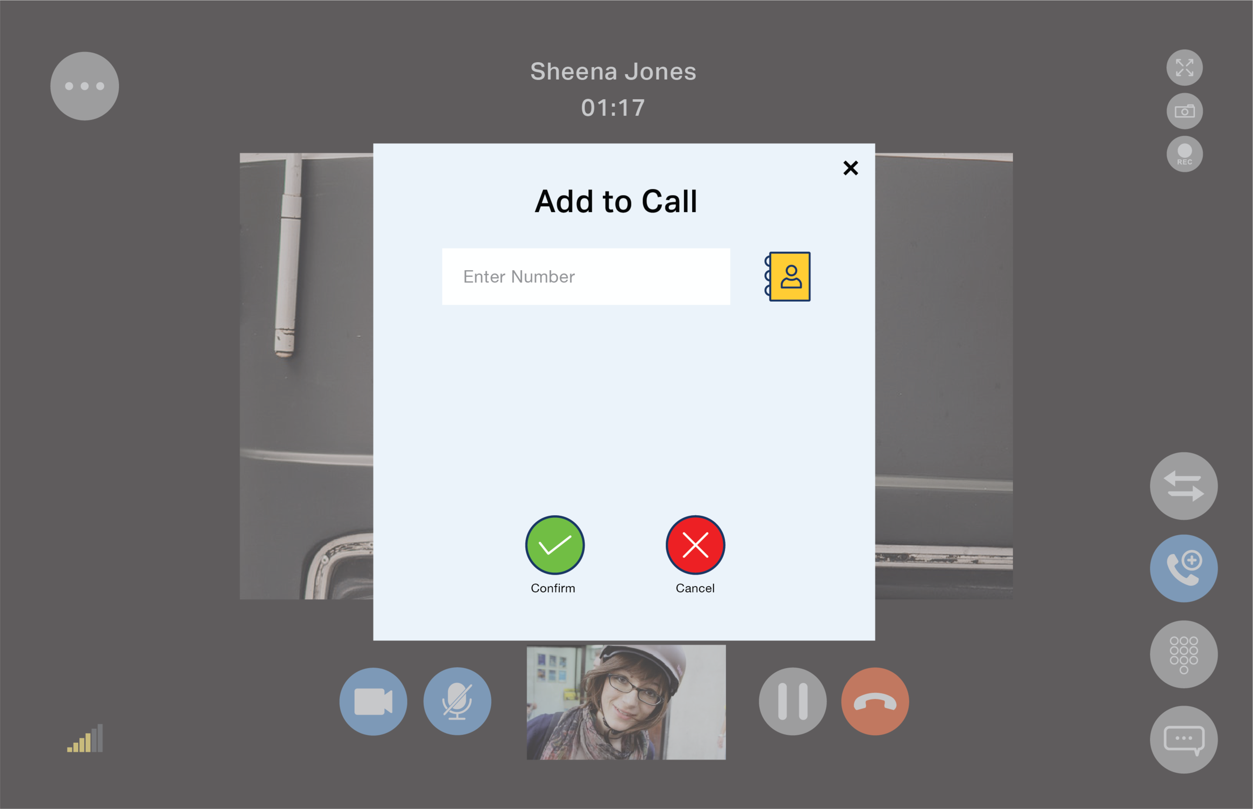
Deltapath Mobile APP Virtual Meeting Implementation
The Virtual Meeting planner exists currently on the Deltapath Switchboard (computer client) and is not yet available for the mobile platform. The Virtual Meeting application exists to create and send out invitations for virtual meetings through either audio or video conferencing. With the Deltapath Mobile application not having the Virtual Meeting function yet, I was requested to design the additional feature add-on to the application. For this design, I was asked to bring over the functionality of the Virtual Meeting and add the intuitive features of smart phones.
Wire Frames

Low-fi Wire Frame for Mobile Virtual Meeting
I first sketched the general outline of screens that I wanted to create. I wanted to lay out the base foundation of the screens to see what I was working with and what was unnecessary.


High-fi Wire Frame for Mobile Virtual Meeting
With the foundation laid out with my sketching, I was able to quickly draw up a high-fi wire frame to share with my team.
High-fi wire frame was created through Adobe Illustrator.
Prototyping
The prototype was created through Adobe XD and sent to the dev team for review. I wanted to make sure some of the functions that I implemented in the mobile version was a viable option and to see if the application would run smoothly like it does on the desktop client.


Pets & Vets - In Times of an Emergency: A UX Case Study
My wife and I have a 12-year old Yorkie that is very active and healthy for his age. One Sunday evening we noticed that his left eye was twitching and he was quite lethargic. With our own vet closed, we spent about 30-mins on Google and Yelp, calling multiple vets to discover that many only accepts existing patients, don’t have ER or urgent care staff, or we were provided with wrong information online. We sat there and thought, “There has to be a better process than this.”
Pets & Vets is an app for pet-owners in time of emergencies or in search of a new and better veterinarian. Whether it is in the middle of the night, just another day at home, or on the road with their pets, pet-owners can rely on this app for any situations.
Discoveries
I wanted to get a variety of pet-owners to take the screener, so I turned to Reddit and posted the questionnaire into several SubReddits and Facebook. Even with 20+ responses in the screener, it was actually hard to find participants to partake in a video interview.
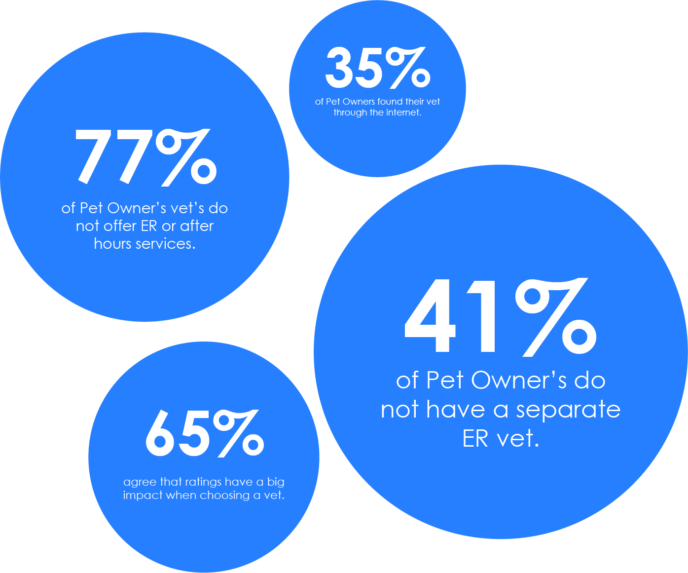
Through the initial screeners, it was discovered that majority of Pet Owners do not have a veterinarian that provide an Emergency or after hours services.
Additionally, it was discovered through the interviews that majority of the pet-owners prefer to search for vets online through their phones through Google or Yelp. While a small percentage of pet-owners chose veterinarians via references or due to proximity, majority relied heavily on ratings and reviews from websites and applications.
Heuristic Analysis Report


I realized early that Yelp and Google dominated all online searches for reviews. However through Google (ironic), I discovered two other websites that offer veterinarian specific search engines: MyPet.com and VetStreet.com. It wasn't very surprising to find these websites as there are hundreds of pet dedicated websites, but I was disappointed that none of these websites offered a mobile app.
Who Is This For?


After the interviews, some in person, some through video conferencing, I was able to gather their quotes, insights, opinions, and stories to develop a persona and their empathy map.
This portion of the entire process is when I realized how important the screeners and interviews were. Although I myself am a pet-owner, there are so many other views and stories out there that opened my eyes.
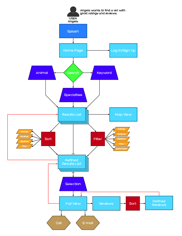
Site Map & User Flow

Initially, I had a difficult time creating the Site Map. I was thinking too far in advance thinking of the User Flow and made the Site Map too complicated. But after realizing that the Site Map is in fact just a skeletal outline of the functionality of the app, it was easy to construct.
The User Flow on the other hand was the easiest part of the process. I was able to put my thought process of how the app would flow directly onto the screen in a flow chart format.
User Story & MVP

Through the initial screeners, research, and interviews, I was able to narrow down the five main features that I wanted to focus on for the MVP. While there was plenty of ideas and suggestions to expand and dive deeper into other features, I decided to keep things simple and chose:
Map View
Filtering Option
Sorting Option
Vet Summary View
Vet Specialties View
With the MVPs set, I was able to create user stories based on the conversations I had during the interviews. Interestingly enough, I noticed that all the work I previously put in during the screeners, interviews, site-maps, and user flows were making each step from this point on easier and easier.
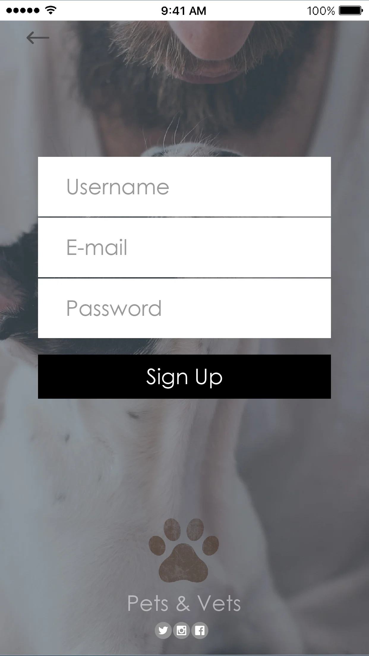
Wireframes


Low-fi Web Browser Wire Frame
The low-fidelity wire frame was created quickly due to my excitement to move forward in the process to finally design a prototype. After showing it to my mentor however, she reminded me to take a look at my interviews again and see what the users preferred for the mode of searching.
DUN DUN DUN... MOBILE!


High-fi Mobile App Wire Frame
Not all hope was lost! Since the skeletal wire frame was done and I had a layout of what I wanted per screen, I was able to take some time and create a high fidelity wire frame for the mobile platform.
Both the low and high fidelity digital wire frames were done through Adobe Illustrator.
Style Guide
The style guide was something I have never done before so it was a bit challenging but enjoyable as well. When I design something, I usually had a color palette given to me or I followed the current color trend. This project however, I researched and chose a palette to fit the app.
I chose the warm neutral base palette with a subtle blue tone to be easy on the eyes. The neutral palette helps bring focus to the blue tone which helps bring a calm and peaceful feeling towards the user.
Additionally I chose the Century Gothic font due to its modern and versatile typeface. It is easy to read and provides many options including different weights.

Prototype
The prototype was created through Invision. I wanted to test out the basic flow of the search process using only the essential content functions without having the smaller items (sorting, filtering, map interaction) distract the user.
You can see the prototype HERE.
User Testing Feedback
After a working prototype was completed via Invision, I again contacted the same interviewees to partake in a user testing feedback session.
The testing went as smooth as the initial interviews did. All the users gave solid feedback and in areas that I never would've imagined that they would comment and they were all able to get through the search function and get to the results screen easily without too many hiccups. At first it was a bit discouraging hearing all the comments, but realizing that their feedback would help fix and take this prototype to the next version, I took the comments with an open mind.
Loading screen (add some kind of message to let users know that it is a loading screen that will pass without interaction)
Add social media syncing (most apps now have Google+ and Facebook syncing for signups and other functions)
Map screen (it does not need sorting or filtering)
Users were confused on how they leave a review (add a review adding button)
Users were wondering how they would contact the veterinarian (add email and call buttons)
Users were confused if all the functions would work if they did not sign up (add FAQ)
All the feedback provided by the users were very helpful. I realized that all the feedback were mostly from my oversight of adding in features that were in the original plan that I overlooked in the design process. While there were comments on the color scheme and some design choices, the usability feedback will be integrated into the next version of the prototype.
But what's next?
Something that all the users pointed out to me was that while this was a great idea, they wanted more. They wanted an app dedicated to pets and their lifestyles. Dog parks, trails, veterinarians, food, groomers, and just all types of different things that the pet-owners can rate and review while sharing with others to provide the best and worst experiences. So, I want to research more, develop more and keep testing out the designs to see if this is a viable product for all the pet-owners out in the world.